


Last Updated: October 1, 2026
Earthy colour palettes are curated groups of warm, nature-derived hues, such as terracotta, ochre, umber and moss, that create calm, grounded rooms. In luxury interiors, they work because they add depth and warmth without the coldness of grey. At Oscar and Mila, we see clients move away from sharp contrasts toward softer, tonal schemes.
Terracotta brings a fired-clay warmth. Ochre adds a golden, sunlit glow. Umber is the deep brown that anchors a scheme, while moss green offers a cool, quiet counterpoint. Together they form a tonal harmony that feels both rich and restful.
Warm neutrals are the defining story in luxury interior design colour trends right now. Sandstone, clay and muted olive are replacing cool grey as the default base. The shift reflects a wider move toward organic modern interiors that feel lived-in rather than showroom-cold.
Cool grey dominated for two decades because it photographed well and felt safe. The problem is it can read as flat and impersonal in a home. Warm neutrals do the opposite. They soften a room and make it feel welcoming, especially under evening light.
Layering textures is how you stop an earthy scheme from looking flat. Colour alone can only do so much. When you learn how to layer textures in luxury interiors, you give a single hue several different surfaces to play off, and the room gains real depth.
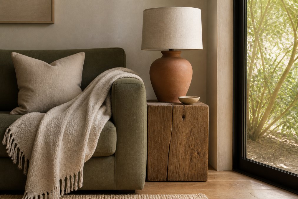
The trick is to keep the colour close and vary the finish. A matte clay vase, a honed stone surface and a raw timber table can all sit in the same warm family. Each one catches light differently.
Metallic accents are the detail most earthy schemes get wrong. The instinct is to avoid them, but a room with no metal can feel heavy and one-dimensional. The fix is to match the metal to the warmth of the palette.
Most guides stop at "warm metals for warm colours". The useful version is more specific, because earthy pigments are not all the same temperature:
A brushed or satin finish scatters light and reads as soft. A polished or mirror finish concentrates light and reads as sharp. Earthy palettes are built on soft, diffused surfaces, honed stone, matte clay, oiled timber, so a polished metal introduces a hard note the rest of the room is not making. If you want a single high-shine moment, keep it to one object and place it where it will catch a specific light source, such as a pendant over a dining table or a lamp base beside a chair.
A practical pattern is one metal moment per sightline. Stand at the main entry to the room and look across it: if you can see four brass objects at once, the metal is no longer an accent. Spread it instead, a drawer pull on one side, a mirror frame on another, a lamp base on a third, so the eye meets metal as it moves through the room rather than all at once.
Visual Comfort AERIN Gaios Table Lamp →
Lighting changes earthy colours more than most people expect. The same terracotta wall can look golden at midday and muddy by night. This is the angle most guides skip, and it decides whether a palette works in practice.
The 60-30-10 rule splits a room into a dominant colour, a secondary tone and an accent. For earthy schemes, use a warm neutral like sandstone for the 60%, a mid-tone like terracotta or moss for the 30%, and a metal or deep umber for the 10%.
| Rule | What It Controls | Earthy Example |
|---|---|---|
| 60-30-10 | Colour proportion | Sandstone 60%, moss 30%, brass 10% |
| 3-5-7 | Variety and balance | 3 colours, 5 textures, 7 accents |
Both rules assume a single, evenly lit rectangular room. Luxury interiors rarely are. A double-height void, a bay window or an open-plan kitchen-living-dining run changes how much of each colour the eye actually reads. In a double-height space, the dominant 60% needs to be the wall and ceiling plane, not the floor, because that is the surface the eye registers first.
A common pattern among designers is to push the dominant neutral higher in rooms used for rest and lower in rooms used for entertaining:
Treat 3-5-7 as a diagnostic. If a finished room feels flat, count the textures, most flat-feeling earthy schemes have three or fewer. If it feels cluttered, count the accents, most cluttered schemes have run past ten small objects in the same tonal family. The numbers are a way to audit a room you have already styled, not a brief to buy seven objects.
Sustainable sourcing is now part of what makes a material luxurious. Buyers want to know where the stone, timber and clay came from. Pieces made by hand and finished by hand carry a story that factory finishes cannot.
Choosing an earthy palette is easy. Making it feel genuinely luxurious, rather than merely brown, is the hard part. It comes down to restraint, honest materials and light.
Pair terracotta or burnt sienna with a neutral base of sandstone or warm white, then add depth with moss green or umber. For a sophisticated look, introduce a metallic accent such as aged brass or bronze. This combination balances warmth and coolness, creating a serene yet luxurious atmosphere that works across living and dining spaces.
Start with a dominant warm hue like ochre or terracotta, then temper it with a cool earthy tone such as moss green or slate. Use the 60-30-10 rule: 60% warm neutral base, 30% cool earthy secondary, and 10% accent (which could be a metallic or a deeper shade). This prevents the space from feeling too hot or too cold and adds visual interest.
Aged brass, bronze, and matte gold work well with warm earth tones like terracotta and ochre, while brushed nickel or pewter suit cooler earthy palettes featuring moss green or slate. Avoid shiny chrome, which can feel out of place. For a cohesive look, repeat the same metallic finish in lighting, hardware, and decorative objects throughout the room.
Texture adds depth and prevents earthy palettes from looking flat. Combine smooth stone with rough clay, soft linen with chunky wool, and polished timber with matte ceramics. Layering textures in luxury interiors creates a tactile experience that reinforces the nature-inspired feel and elevates the overall sophistication of the space.
Leave a comment