


Last Updated: September 15, 2026
A home that reads as one considered whole, rather than a series of disconnected rooms, is the clearest marker of good design. Cohesive interior and exterior design carries a consistent palette, material language and lighting strategy from the front gate to the back bedroom, so the eye never registers a hard stop between zones. At Oscar and Mila, we see clients who invest in beautiful individual pieces still end up with a house that feels unresolved because nothing ties the spaces together.
The payoff is not just aesthetic. A unified design scheme makes a property feel larger, calmer and more valuable, and it removes the decision fatigue that comes from treating every room as a fresh start. According to guidance from the Australian Institute of Architects on residential design, the strongest homes are conceived as a single spatial narrative rather than a collection of separate projects.
The fastest route to cohesion is a single colour palette governing both interior and exterior. Choose three to five core tones and allocate them by proportion: roughly 60 per cent dominant neutral, 30 per cent secondary mid-tone and 10 per cent accent, with one dark tone for grounding. The same palette appears inside and out, in different ratios.
A common mistake is treating the garden as a separate project with its own colour story. The exterior should feel like the interior palette stepped outside: if your living room leans on warm stone, oatmeal and aged brass, the facade, paving and outdoor furniture should echo those tones rather than introducing a cool grey scheme.
Most homeowners already own the seeds of a workable palette, they just have not named it. Before buying anything, pull together the five to eight objects you love most, a rug, a piece of art, a cushion, a timber bowl, a favourite ceramic, and lay them side by side in daylight. The recurring tones are your palette, anchoring the scheme to your actual taste rather than a trend board.
From that group, identify:
Test the palette in situ before buying anything large. Paint A2-sized sample boards in your interior tones, move them around the room across a full day to watch how they shift in morning, midday and evening light, then carry them outside against your paving, render and fence. If a tone that looks rich indoors turns muddy outside, it belongs inside only.
For fabrics and finishes, order physical swatches rather than relying on screen colours, and place each next to your flooring sample and intended hardware finish. If the three read as a family, you have your palette; if one fights the others, swap it now, not after delivery.
You do not need to repaint or refloor to establish palette continuity. If you rent, or a renovation is off the table, work with the surfaces you cannot change and repeat your palette through what you can:
Renters often treat each room as a separate styling exercise. The fix is to pick one accent colour and refuse a second until the first is repeated in at least three places across both zones.
Genuine indoor outdoor flow design ideas start with sightlines, not furniture. Stand at the furthest interior point of your home and look toward the garden: whatever you see framed in that view, a focal tree, a water feature or a sculpture, should be deliberately placed.
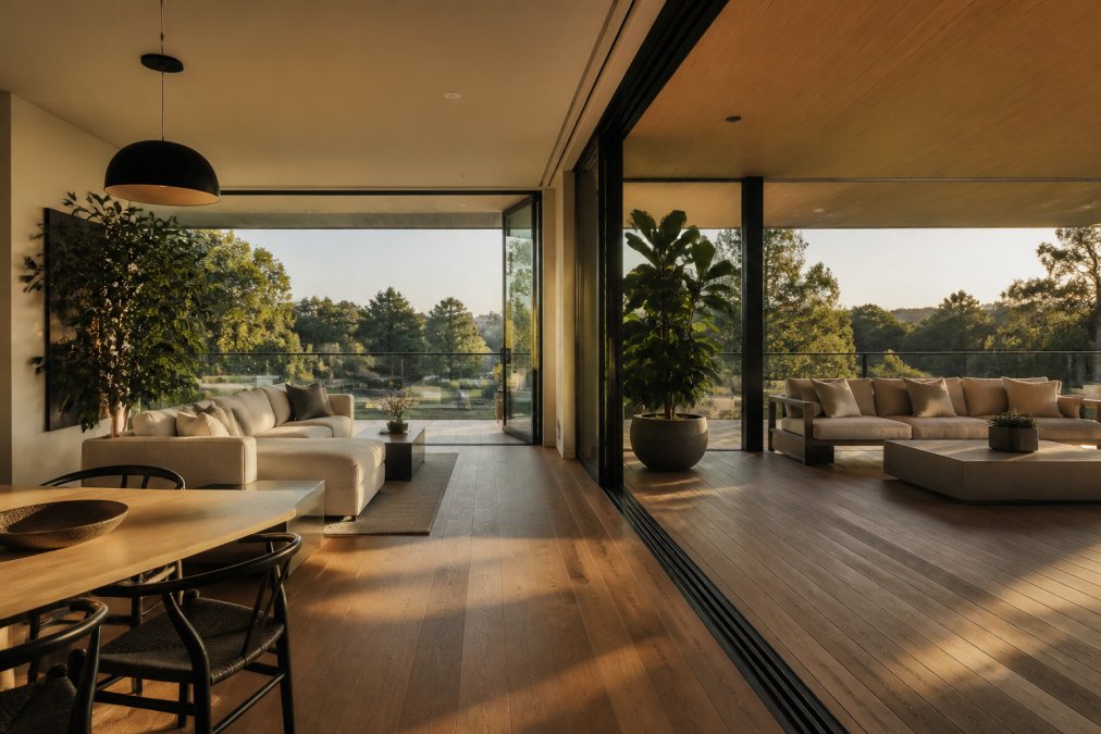
A well-resolved transition zone does four things:
A few practical rules that most articles skip:
| Element | Interior Choice | Matching Exterior Choice |
|---|---|---|
| Primary metal | Aged brass tapware and pulls | Aged brass wall lanterns |
| Flooring tone | Warm mid-tone timber | Warm-toned external tile |
| Core material | Natural stone benchtop | Matching stone paving inlay |
| Accent colour | Terracotta cushions | Terracotta planters |
The 70/30 rule splits a scheme into 70 per cent dominant colour and 30 per cent secondary or accent tones. Applied across indoor and outdoor zones, you would use the same dominant neutral on walls, large upholstery and paving, then repeat the 30 per cent accent in cushions, planters and outdoor lanterns. This keeps the eye moving between rooms and garden without either space feeling like a separate project. A cohesive interior scheme built on this ratio makes exterior extension far simpler.
Start with the threshold itself. Level the floor height where possible, continue the same flooring material or a close-toned alternative onto the terrace, and repeat at least two materials from inside on the exterior, such as timber, brass or stone. Choose indoor outdoor flow design ideas that treat the doorway as a frame rather than a barrier: matched ceiling heights, aligned sightlines and consistent lighting temperature all reduce the visual break. Furniture scale should also step down gradually rather than shrink abruptly.
Match colour temperature first. Warm white around 2700K to 3000K works in both living areas and covered outdoor zones, so the eye reads one continuous space after dark. Then repeat fixture families or finishes: a brass wall lantern outside pairs naturally with brass sconces or picture lights inside. Luxury outdoor lighting design should also mirror interior layering, combining ambient, task and accent light rather than relying on a single overhead source.
Look for finishes that perform in both environments and share a visual language. Solid brass, for example, ages gracefully outdoors and reads as a premium detail indoors. Timber species should match or complement rather than contrast. Stone and concrete work inside and out when the tone is consistent. The goal is a material palette of three to five repeated finishes across the whole property, so each zone feels drawn from the same design thread.
Begin with the fixed elements you cannot change: paving, roof, large windows and existing flooring. Pull one or two tones from those and build the interior around them. Neutrals with warm undertones tend to bridge both zones well. Then introduce accent colours in small doses, such as cushions, ceramics or planter glazes, so the palette stays flexible. Testing samples in both natural and artificial light before committing avoids surprises.
Furniture carries the design narrative from room to room. Repeating a shape, a leg profile or a finish across indoor and outdoor pieces creates spatial harmony without matching everything exactly. Scale and proportion matter too: an outdoor lounge should feel like a natural extension of the interior seating, not a smaller imitation. Choosing pieces from a curated range, such as coordinated lanterns and sconces, keeps the thread consistent from entryway to garden.
The 3-5-7 rule refers to grouping accessories in odd numbers, typically three, five or seven items, to create visual balance. It works outdoors just as well as inside. Cluster three planters of varying heights on a terrace, or arrange five cushions across an outdoor sofa. Odd numbers feel more natural to the eye than even ones, and the principle helps you style curated accessories without overcrowding a space.
Leave a comment